Wardley Mapping Canvas Template
Build an intuitive understanding of your business context.
About the Wardley Map template
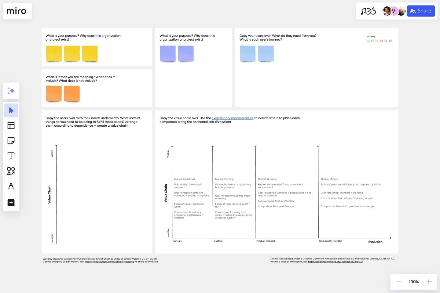
What is a Wardley Map?
A Wardley Map was developed to map the structure of a business, understand its context, and better serve users. You place components with value on the y-axis and commodity on the x-axis.
Every organization operates within a landscape that contextualizes and influences your decisions. To build a Wardley Map, you must illustrate that landscape as a value chain. What’s a value chain? It’s a series of activities or elements that are required to meet a user’s needs. You categorize each element of the value chain according to their stage of evolution compared to the competition. The resulting Wardley Map describes your assumptions and intentions for anyone to read.
The goal of Wardley mapping is to build a shareable, scalable visualization of the landscape surrounding your business. It allows you to articulate your strategy while summarizing the landscape in a way that’s easy to understand. A Wardley Map is like a time capsule, capturing your understanding at a certain point in time and documenting it for the future.
Why use a Wardley Map?
Use a Wardley map to assess future scenarios, quickly validate solutions, and develop a shared visual understanding of a business' context. Using a Wardley Map, you can significantly reduce a project's risk and avoid costly mistakes.
The benefits of using a Wardley Map
Benefit 1 - Enhance communication. Easily communicate your understanding of the landscape to your team, new hires, and stakeholders. Wardley Maps are powerful tools that can help get new employees up to speed quickly, so they can hit the ground running on day one.
Benefit 2 - Identify risks and opportunities. A Wardley Map clearly lays out the environment in which your product is operating, as well as the value chain that constrains it. This allows you to understand the challenges ahead and how can exploit market gaps.
Benefit 3 - Reduce costs. Wardley Maps help ensure everyone on your team is aligned, and that cross-functional partners share your understanding of the landscape. This alignment reduces costly errors and streamlines your processes.
Benefit 4 - Foster collaboration. Wardley mapping empowers you to minimize risk and conflict across your teams. Teams that engage in Wardley mapping report higher satisfaction, deeper understanding, and closer alignment on shared goals.
Get started with this template right now.
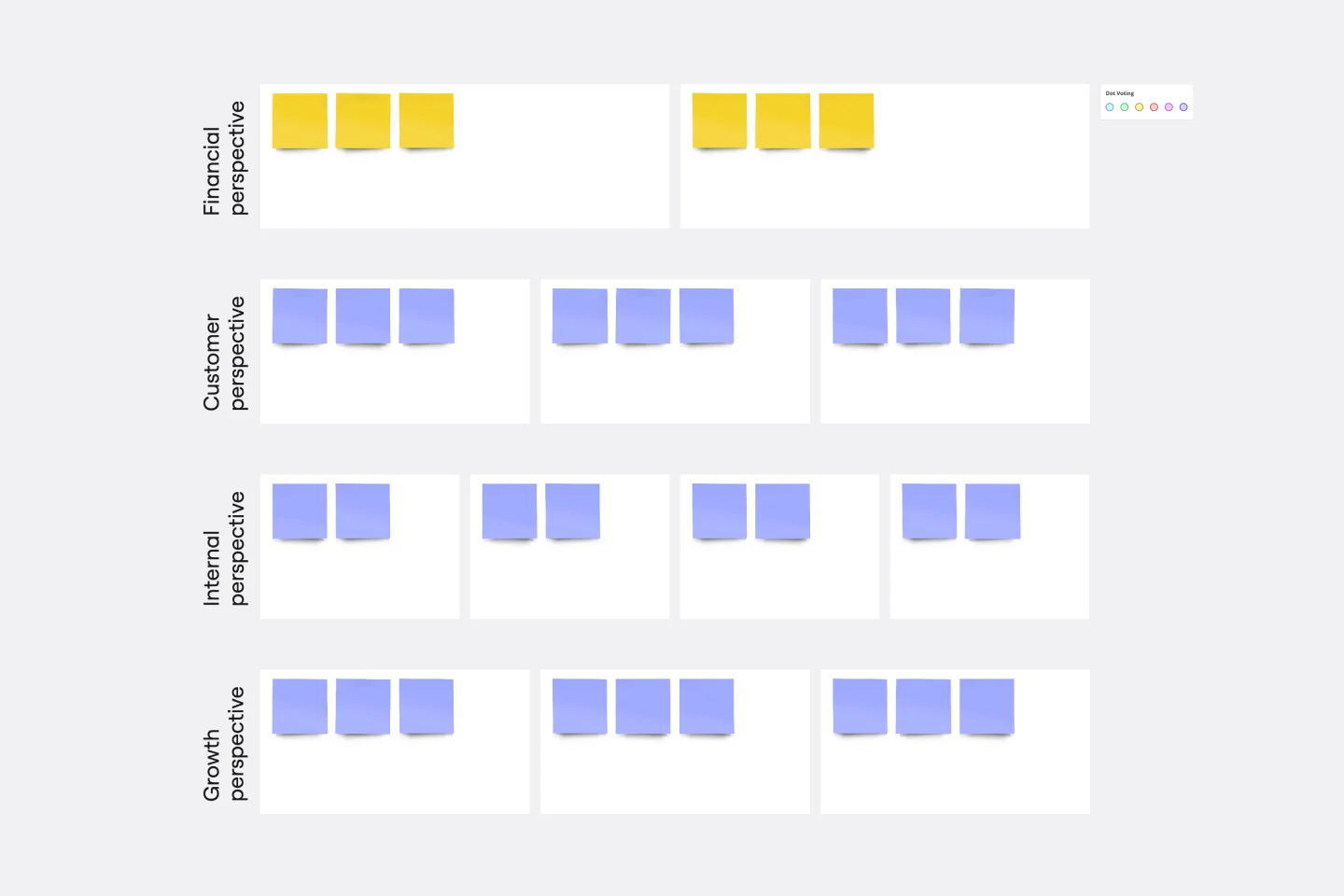
Strategy Map Template
Works best for:
Leadership, Strategic Planning, Mapping
How do your individual or team goals relate to an organization’s overall strategy? A Strategy Map is a stylized picture of your organization’s strategy and objectives. It’s powerful because it provides a clear visual guide to how these various elements work together. Strategy Maps can help align various different team goals with the overall strategy and mission. With the Strategy Map in place, teams can create set actionable, relevant KPIs. Strategy mapping is often considered part of the balanced scorecard (BSC) methodology, which is a strategic planning tool for setting overall team goals.
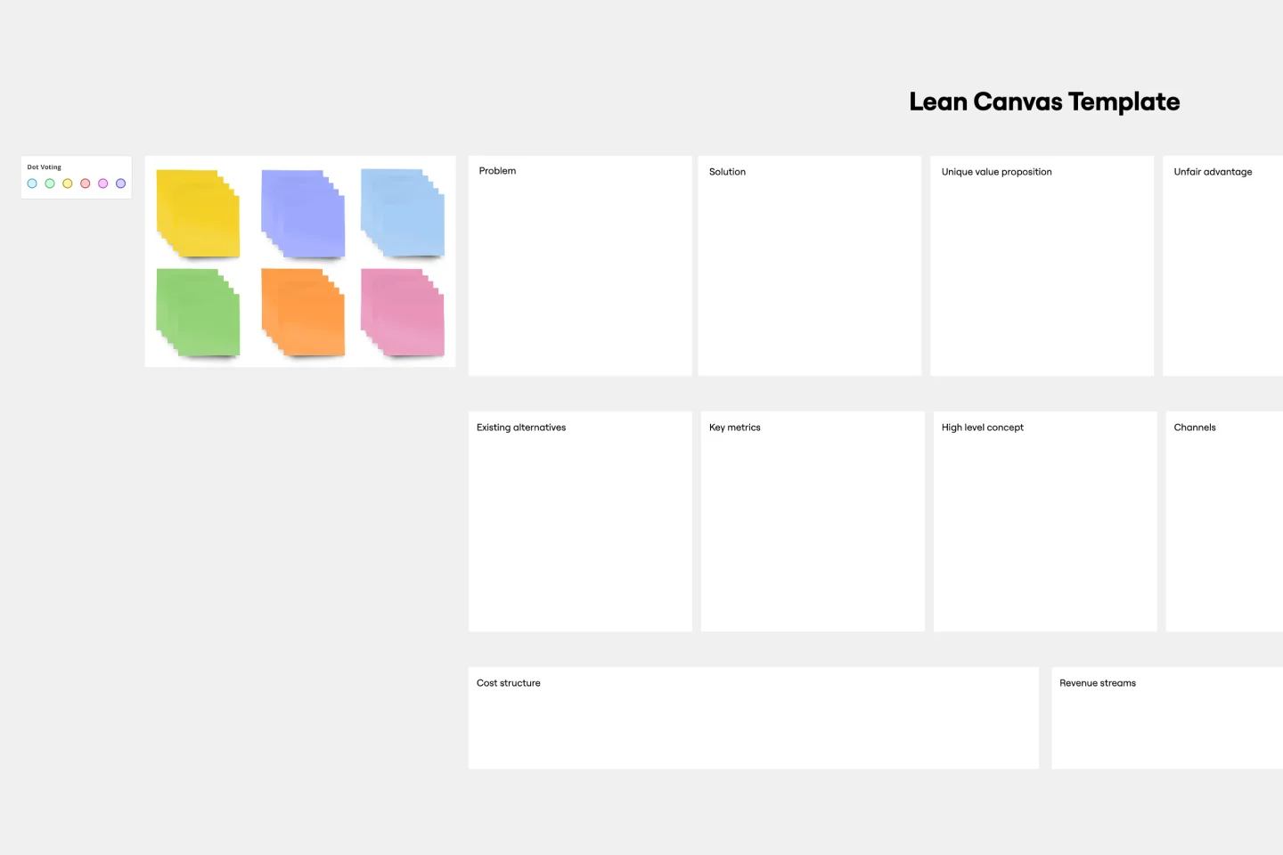
Lean Canvas Template
Works best for:
Agile Methodology, Strategic Planning, Agile Workflows
Business opportunities can get dense, cumbersome, and complex, and evaluating them can be a real challenge. Let a lean canvas streamline things and break down your business idea for you and your team. A great tool or entrepreneurs and emerging businesses, this one-page business model gives you an easy, high-level view of your idea — so you can stay focused on overall strategy, identify potential threats and opportunities, and brainstorm the various factors at play in determining your potential profitability in an industry.
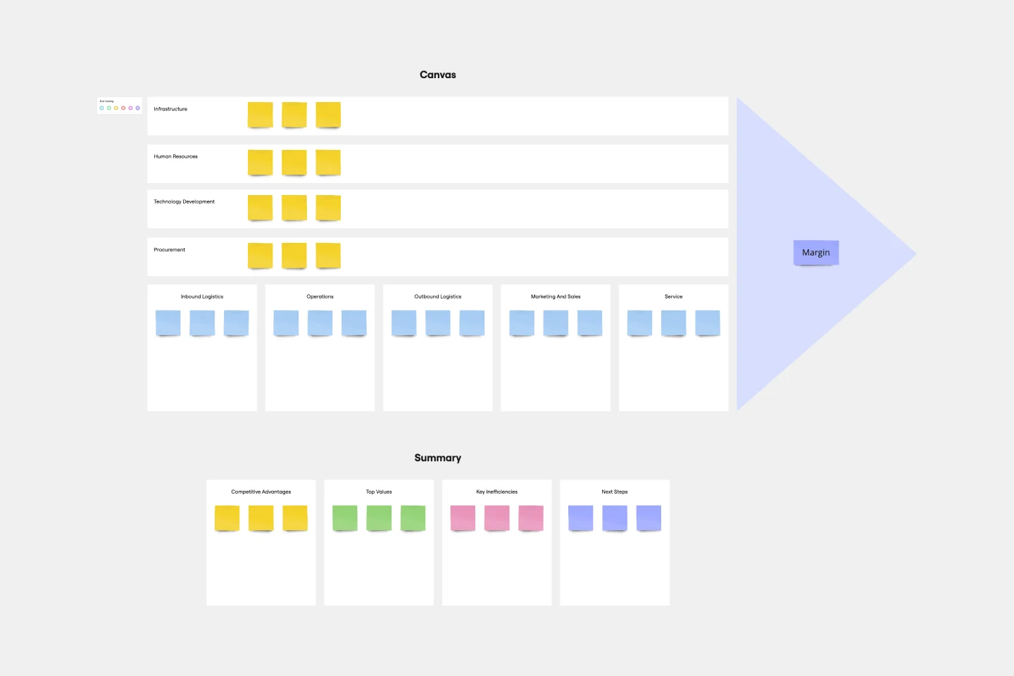
Value Chain Analysis Template
Works best for:
Leadership, Strategic Planning, Workflows
First coined by Harvard Business School professor Michael Porter, the value chain analysis helps your team evaluate your business activities so you can find ways to improve your competitive advantage. A value chain is a set of activities that a company performs in order to deliver a valuable product from start to finish. The analysis itself allows your team to visualize all the business activities involved in creating the product—and helps you identify inefficiencies, bottlenecks, and miscommunication within the process.