UML Communication Diagram Template
Get a complete snapshot of how every object in your program interacts with all the others.
Available on Enterprise, Business, Education plans.
About the UML Communication Diagram Template
Easily create a big-picture snapshot of a system’s object interactions using Miro’s UML communication diagram template. With pre-made symbols from our extensive UML shape pack, text boxes, and connection lines, the template is fully customizable — which means all you have to do is edit it and make it your own.
You’ll also have access to our powerful visual workspace, allowing you to easily expand on the template using our automated diagramming tools, seamlessly collaborate online, and choose from multiple ways to share or present your work.
We’ll walk you through how to make the most of our UML communication diagram template.
How to use the UML communication diagram template
To get started, click the blue “Use template” button to open the UML communication diagram template in Miro. Then, invite anyone you’d like to collaborate with to edit your board. Once you’re ready, follow the steps below to start filling out the communication diagram template:
1. Decide on functions
Creating a communication diagram is about getting a holistic snapshot of a feature or a whole product. Start by deciding what you want to model and your goals for filling out the communication diagram template.
2. Visualize objects
The communication diagram template comes with pre-made shapes you can use to represent the objects in the function you’ve chosen. Double-click on any of them to edit the text and label your objects.
Need more shapes? Instantly duplicate them using our automated diagramming tools. Click on any of the pre-made shapes to reveal blue dots on each side, then click on any dot to generate a new connection line from that point with a matching shape on the other end — saving you time from having to create new shapes and connect them yourself.
3. Connect related objects
Speaking of connections, let’s link the objects up. Use the template’s pre-made connection lines to link objects that communicate with one another. To rearrange a connection line’s direction, click on it to reveal white dots on each end, which you can click and drag. Use the blue dot in the middle of the line to adjust its curve.
4. Label the arrows
Remember, UML communication diagrams are all about providing a big-picture snapshot of a software’s interactions. And with multi-sequence processes, we’ll need to label the order these communications happen in by customizing the text boxes along the arrows.
You don’t have to get as detailed as you would in a sequence diagram, but you should add any information necessary to grasp the overall function.
5. Customize the template
Customize the communication diagram template by changing shape colors and sizes or editing font types. You can even customize connection lines by clicking on them to reveal the pop-up menu and then adjusting their line end or line type.
Share important context by grabbing sticky notes or cards from the toolbar, add stickers to enhance your Miro board, or drag and drop your own files and images for a personal touch.
Want to try building your communication diagram from scratch? Discover what our intuitive UML diagram tool can do for your team.
Example of an effective communication diagram
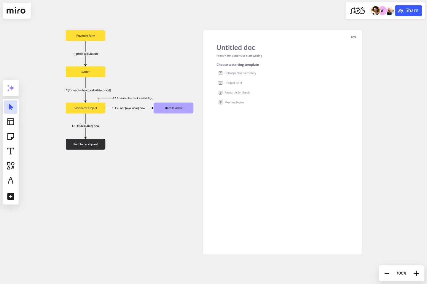
Let’s run through an example of how you could fill out the communication diagram template. Imagine you’re building an app where users can purchase plane tickets.
First, define all your objects. The list might include:
Landing page
Login window
User profile
Search interface
Search results page
Purchasing window
Purchase confirmation
Email confirmation
Select shapes for each object and lay them out in the communication diagram template. Next, connect the objects that work directly with each other: the login window and profile, the search feature and results, the purchase flow, and so on.
When one object communicates with another, add an arrow. For example, the search interface and search results work in a loop, so each should have an arrow pointing at the other.
Finally, look for multi-step sequences and add numbers to define how they work. The purchasing and payment flow is a common multi-step process.
Does Miro provide UML shapes?
Yes, Miro has an extensive UML shape pack — allowing you to populate the communication diagram template with standard UML symbols. Get access to the UML shape pack when you sign up for a Business, Enterprise, or Education plan.
Why create a communication diagram?
A communication diagram helps you illustrate the inner workings of a program by representing it as a series of connected shapes. At a glance, you can tell what objects make up the program, how they work together, and the general order of operations. Miro’s communication diagram template saves you time from having to build a diagram from scratch, allowing you to create a visual overview of your system in minutes.
What are the key elements of a communication diagram?
A communication diagram is made up of shapes (representing objects), lines (representing relationships), arrows (representing one-way or two-way communication), and numbers (representing an order of operations).
How are sequence diagrams and communication diagrams different?
Sequence diagrams illustrate how a process unfolds over time, while communication diagrams focus on a broad snapshot of what’s happening in a single moment. Their functions overlap, but they aren’t identical.
Get started with this template right now. Available on Enterprise, Business, Education plans.
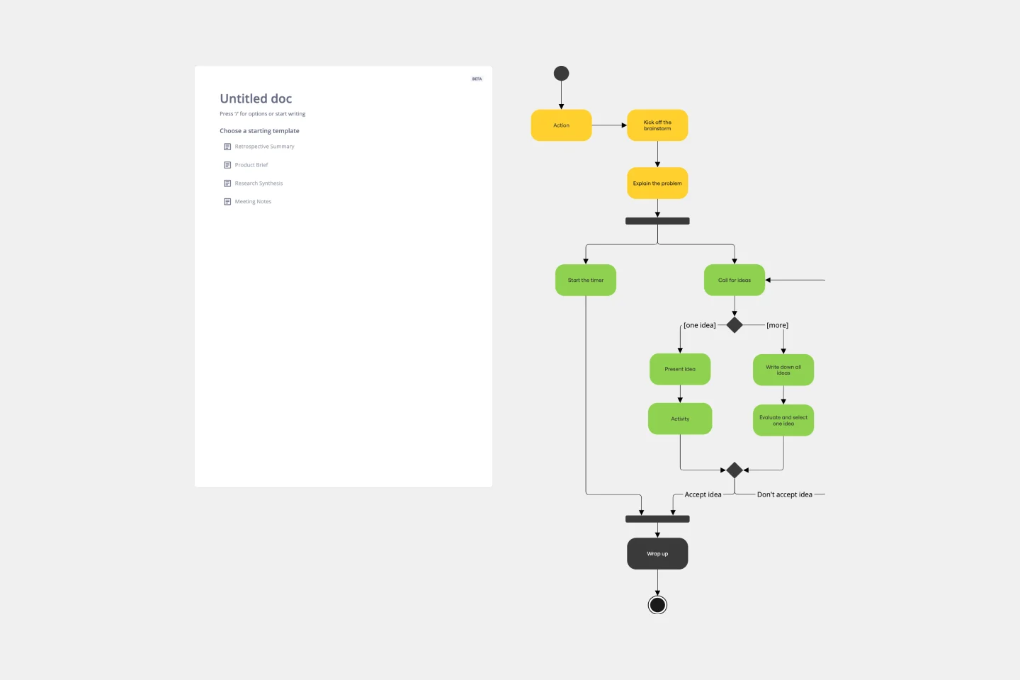
UML Activity Diagram Template
Works best for:
Diagrams
Use our Activity Diagram template to break down activities into smaller decisions and subprocesses. Improve and optimize systems and processes in I.T., business management, and more.
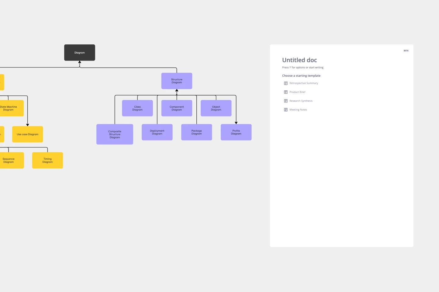
UML Class Diagram Template
Works best for:
UML Class Diagram Template, Mapping, Diagrams
Get a template for quickly building UML class diagrams in a collaborative environment. Use the UML class diagram template to design and refine conceptual systems, then let the same diagram guide your engineers as they write the code.

UML Component Diagram Template
Works best for:
Mapping, Diagrams, Software Development
Use our Component Diagram template to show how a system’s physical components are organized and wired together. Visualize implementation details, make sure planned development matches system needs, and more — all in a collaborative environment.