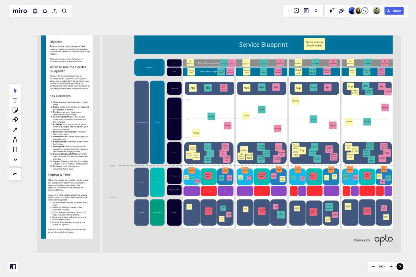
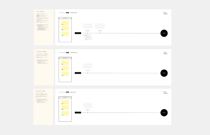
Service Blueprint
This canvas is designed for services provided mainly by digital platforms.
Objective:
In 90 minutes, the team should be able to map the first iteration of the service blueprint by portraying the ideal customer experience and which operating activities are necessary to make every stage happen.
This canvas is designed for services provided mainly by digital platforms.
When to use the Service Blueprint?
Think of the Service Blueprint as an extension of the Customer Journey, that allows you visualize both the customer and the company activities, identifying the contact points where their activities relate by ensuring the creation of an optimal service.
Key Concepts:
Time: average client's duration in each stage.
Stage: period in which the development of a process is divided.
Section: customer experience, operation and technology.
User Contact Points: main actions where the customer has contact with the company.
Activities: customer's main activities, when acquiring or interacting with your product or service.
Emotional Thermometer: emotions felt in each stage.
Operation Line: where the company's activities begin.
Visibility Line: where the actions meet technology.
Description: description of how the department interacts with the customer and makes the stage possible.
Roles & Responsibilities: define the commissioned and describe their main activities.
Type of Contact: describe if it is either a digital or a face-to-face contact point.
Systems: point out where an integration takes place.
Format & Time
Filling this canvas can be either an individual or a collaborative activity. In case that it is designed mainly by one person, the objective is to fill out every concept as described below.
In case it is filled collaboratively, the activity should unfold in a timed brainstorm dynamic in the following order:
Each member chooses a colored post-it stacks.
Define the different stages of the Customer Journey.
Fill out with post-its every section of a stage in a short period of time.
Discuss the ideas with your team and cluster similar ideas.
Remark the main conclusions at the end of the dynamic.
Note: In case you are filling this with a client be sure to guide the dynamic.
Get started with this template right now.
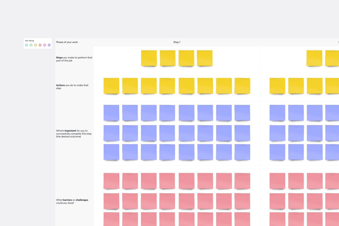
Job Map Template
Works best for:
Design, Desk Research, Mapping
Want to truly understand your consumers’ mindset? Take a look at things from their perspective — by identifying the “jobs” they need to accomplish and exploring what would make them “hire” or “fire” a product or service like yours. Ideal for UX researchers, job mapping is a staged process that gives you that POV by breaking the “jobs” down step by step, so you can ultimately offer something unique, useful, and different from your competitors. This template makes it easy to create a detailed, comprehensive job map.
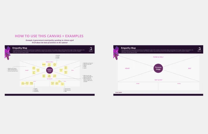
Empathy Map Canvas
Works best for:
Market Research, Strategy & Planning
The Empathy Map Canvas template allows you to explore user behaviors and emotions comprehensively. It’s designed to help you visualize user experiences and create solutions that truly meet their needs. Perfect for UX teams and product developers.
Empathy Mapping
Works best for:
Research & Design, Market Research
The Empathy Mapping template helps teams capture detailed user insights. By understanding user perspectives, you can improve product features and customer satisfaction. This template is perfect for user research and product development.
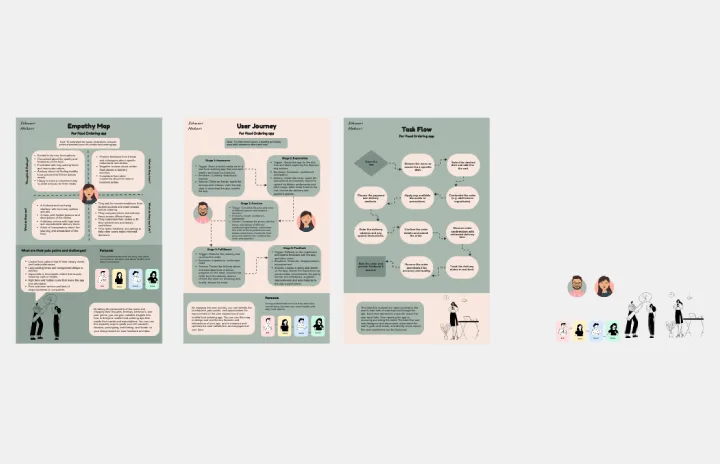
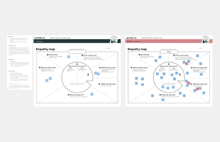
Empathy Map
Empathy Map template aids in visualizing your users' experiences. It helps teams understand what users see, think, and feel, ensuring your product meets their needs. This tool is essential for building empathy and designing better user experiences.

Service Blueprint Workshop
Works best for:
Research & Design
The Service Blueprint Workshop by Lidia Olszewska is designed for collaborative service design sessions. This template helps teams visualize service processes, identify pain points, and brainstorm solutions. Use it to align cross-functional teams, improve service delivery, and ensure a seamless customer experience. It's ideal for workshops aimed at service optimization, fostering collaboration, and strategic planning in service design.
Practical Customer Journey Mapping
Works best for:
Customer Journey Map
Today, customers hold companies to high standards for product quality and user experience.