Pie Chart Template
Present relationships between datasets and see contrast right away with the pie chart template.
About the Pie Chart Template
A pie chart template shows the relationships between datasets, illustrated within a circle. It’s often also referred to as a circle chart. The circle sections look like slices of a pie and represent different datasets so that you can easily compare them all at once. The Pie Chart Template is an excellent tool to enhance presentations and make data more digestible to any audience.
What is the pie chart template
The pie chart template is a circle with sections, representing the pie ‘slices’, with the arc’s length being proportional to the quantity represented. The sections making up the pie chart, often displayed in percentages, are equal to 100% when added up, making a full circle.
When to use the pie chart template
Professionals across many industries use pie charts to compare data and show contrasts. It’s one of the most used diagrams since it can be easily read and interpreted.
Business organizations and the educational sector use pie charts and other graphs to support storytelling with visual data, and engage audiences easily and more quickly.
How to create a pie chart
You can easily make a pie chart in Miro, either using our ready-made template or drawing one from scratch. Miro’s extensive diagramming capabilities make it the perfect pie chart maker, where you can, with just a few clicks, create your own pie chart.
How to make a pie chart using our ready-made template:
Select the pie chart template.
Double-click the pie chart to add data to each series. Make sure to add real numbers and not percentages.
Edit title and legend.
After you set your pie chart, you can edit how it looks and change the colors as you like.
How to create a custom pie chart:
Click ‘charts’ on the toolbar.
Select the object, in this case, the pie chart.
Double click the pie chart. A pop-up window will show.
Add your data.
In Miro, you can edit the values of your pie chart, and the colors will be selected automatically.
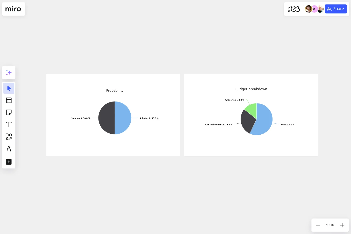
A pie chart example
Let’s say you want to save on your water consumption. To analyze how much water you are using, you can create a pie chart to show all the ways you consume water and how much water each of them uses. You can add toilet consumption, shower, kitchen sink, washing machine, dishwasher, and any leakages. For each of these, add the percentage of their consumption.
As you can see, the total consumption should be 100%, which will configure your whole pie chart.
With this pie chart, you can see right away which one has the most significant share of consumption and which one has the lowest.
Where can I create a pie chart?
People often create a pie chart to visually show data when doing presentations or delivering reports. Miro is an excellent pie chart maker, where you can easily create your pie chart and attach it to any other document by either downloading or embedding your pie chart template board. Highly customizable, our pie chart template is also easily shareable so you and your team can add ideas and make communication flow easier with it. Try it for yourself and see if that works for you.
Get started with this template right now.
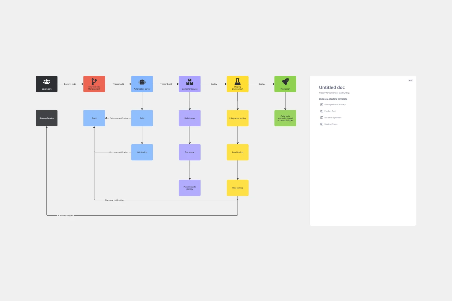
CI/CD Pipeline Diagram Template
Works best for:
Diagramming, Development
The CI/CD template is a well-designed roadmap for software deployment that enables a smooth and automated flow from development to production. This strategic layout includes critical elements such as source code management, automation servers, container orchestration, staging environments, and the final deployment to production. One of the key benefits of using such a template is that it builds a robust deployment pipeline, which significantly reduces manual intervention and human error. By visualizing each step and integrating automation throughout, teams can achieve faster deployment cycles, ensuring that new features, updates, and fixes are delivered to users promptly and reliably. This enhanced pace does not compromise quality, as the template inherently supports continuous testing and quality assurance, ensuring that each update is quick but also secure and stable before it is delivered to the end user.
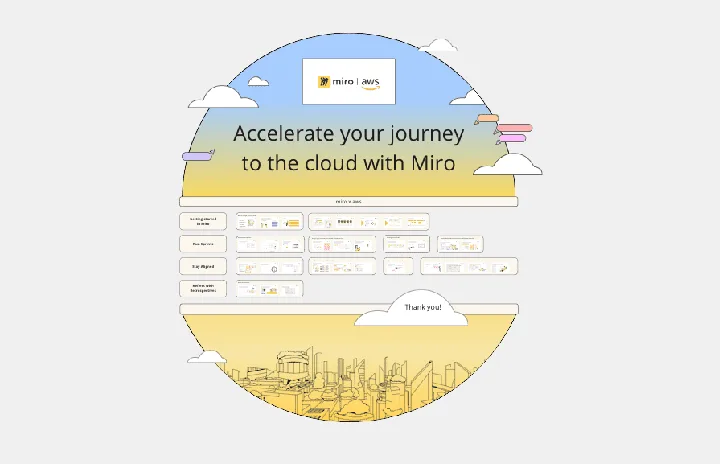
Miro x AWS: Accelerate your cloud journey
Works best for:
Diagramming
The Miro x AWS: Accelerate your cloud journey template offers a visual framework for planning and executing cloud migration and optimization projects using Amazon Web Services (AWS). It provides elements for mapping out cloud architectures, migration strategies, and cost optimization initiatives. This template enables teams to collaborate effectively, align on objectives, and accelerate their cloud journey with AWS services. By promoting collaboration and alignment, the Miro x AWS template empowers organizations to leverage AWS cloud technologies efficiently and achieve their business objectives effectively.
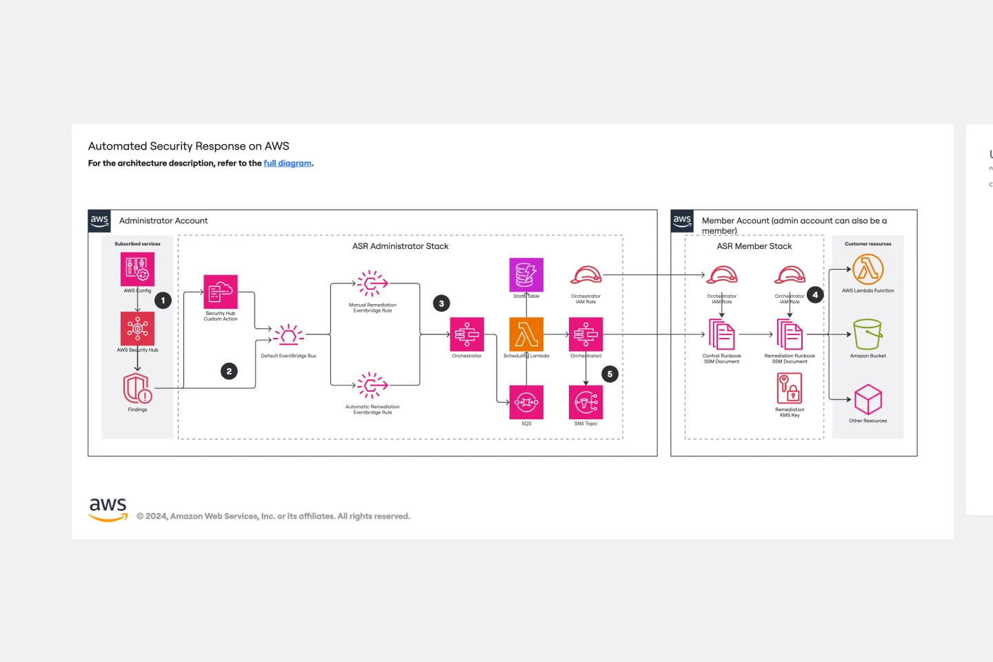
Automated Security Response on AWS Template
Works best for:
AWS
The Automated Security Response on AWS template is a tool for enhancing AWS security through automation, enabling quick identification and mitigation of threats with minimal manual effort. It integrates with AWS security services for a dynamic response mechanism, ensuring infrastructure security against evolving threats. This template streamlines operational efficiency, offers scalable and customizable security strategies, and accelerates threat response times, making it essential for improving AWS security posture.
Job Search Process Diagram
Works best for:
Diagramming
The Job Search Process Diagram template offers a visual tool for mapping out the steps and stages involved in the job search process. It provides a structured framework for organizing tasks, tracking progress, and managing resources. This template enables job seekers to streamline their job search efforts, stay organized, and increase their chances of success. By promoting clarity and efficiency, the Job Search Process Diagram empowers individuals to navigate the job market effectively and achieve their career goals.
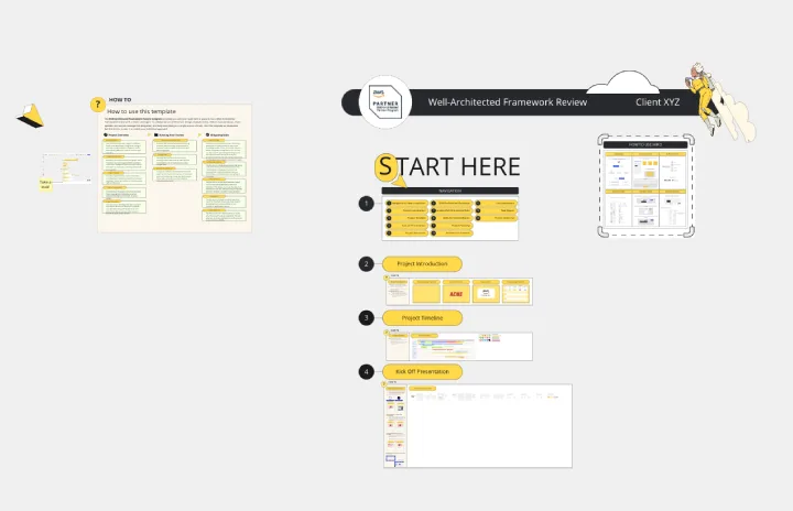
Miro for AWS Well-Architected Framework Reviews
Works best for:
Diagramming, AWS
This AWS Well-Architected Framework Review (WAFR) template provides you and your team with a dedicated space to conduct a Well-Architected Framework Review with a client.
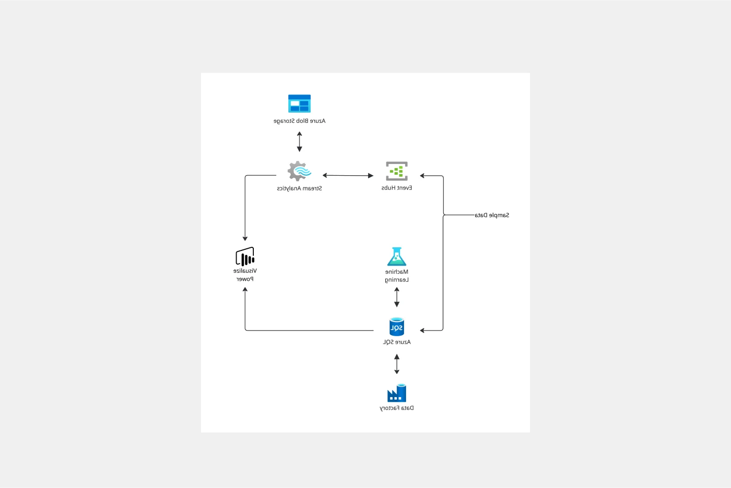
Azure Demand Forecasting Template
Works best for:
Software Development, Diagrams
The Azure Demand Forecasting diagram will show the architecture of a demand forecast, making it easier for you to predict data consumption, costs, and forecast results. Azure is Microsoft’s cloud computing platform, designed to provide cloud-based services such as remote storage, database hosting, and centralized account management. Azure also offers new capabilities like AI and the Internet of Things (IoT).