Causal Loop Diagram Template
Visualize system relationships and improve problem-solving.
About the Causal Loop Diagram Template
The causal loop diagram template is a robust resource designed to visualize complex interrelationships within systems. By providing an organized framework, this template enables the in-depth exploration of interactions, promoting a comprehensive understanding of systems and helping in effective problem-solving.
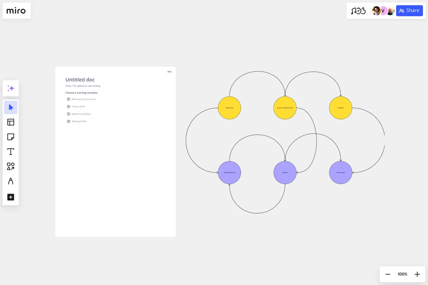
What's a causal loop diagram template?
A causal loop diagram (CLD) template is a tool that showcases the system's feedback loops and cause-and-effect relationships. Instead of viewing issues in isolation, this diagram gives a holistic view of the interactions between various system components. The template provides a structured framework, enabling teams to chart out these interconnections in an organized and easy-to-understand manner.
How to use the causal loop diagram template in Miro
Miro has intuitive features, making the creation of a CLD seamless:
Shapes library: Select the feature in the toolbar. Here, you can choose different shapes representing many elements within your system.
Arrows and connections: Use arrows to depict the direction of influence between elements. Positive and negative feedback loops can be indicated using '+' and '-' signs.
Customization: Change colors, sizes, and labels to differentiate and categorize the elements as needed.
Drag and drop: Simply drag your chosen elements onto the Miro board and position them to create your causal loop diagram.
Why should you use a causal loop diagram template?
Holistic viewpoint: The template helps understand the bigger picture by visualizing a system's complex web of relationships.
Effective problem-solving: By recognizing the underlying patterns and structures, teams can address root causes instead of superficial symptoms.
Enhanced communication: A well-structured CLD fosters clarity in discussions, promoting shared understanding amongst team members.
Strategic planning: The template helps identify use points, helping in effective decision-making and strategic interventions.
Do you need more advanced diagramming capabilities? Check Miro's diagram maker features.
What is the difference between a positive and a negative feedback loop?
A positive feedback loop amplifies changes, driving the system further from its original state. A negative feedback loop stabilizes the system, pushing it back towards a desired equilibrium.
Can I collaborate in real time with my team on the CLD?
Yes, Miro's workspace supports real-time collaboration, allowing team members to edit, comment, and discuss the diagram.
How can I share my causal loop diagram with stakeholders?
Miro offers easy sharing options. You can invite stakeholders to view or edit the board directly or export the diagram as an image or PDF to share externally.
Is there a limit to the complexity of the system I can map?
While Miro offers a vast canvas, ensuring your CLD remains readable and understandable is essential. If a system is exceedingly complex, consider breaking it down into smaller sub-systems for clarity.
Get started with this template right now.
Context Diagram Template
Works best for:
Business Management, Mapping, Diagrams
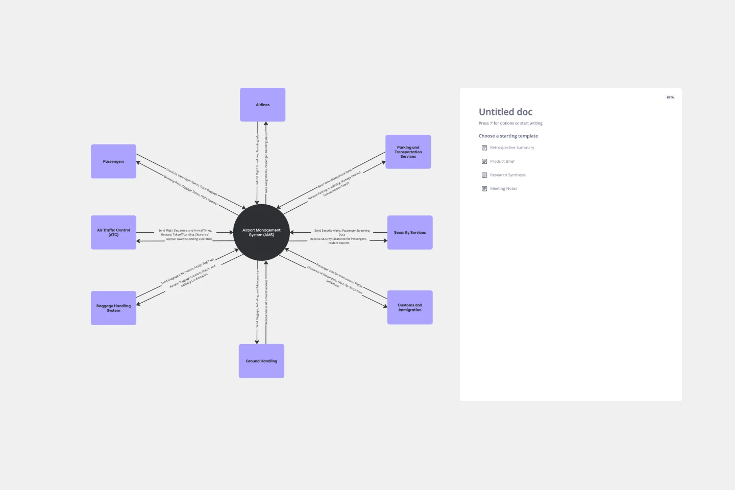
A context diagram is a perfect tool to view an entire system as a single process and understand how external factors interact with it. These external factors can include customers, developers, management, and more. The Context Diagram Template is your tool for creating this diagram.
Change Control Process Template
Works best for:
Agile Methodology, Documentation, Product Management
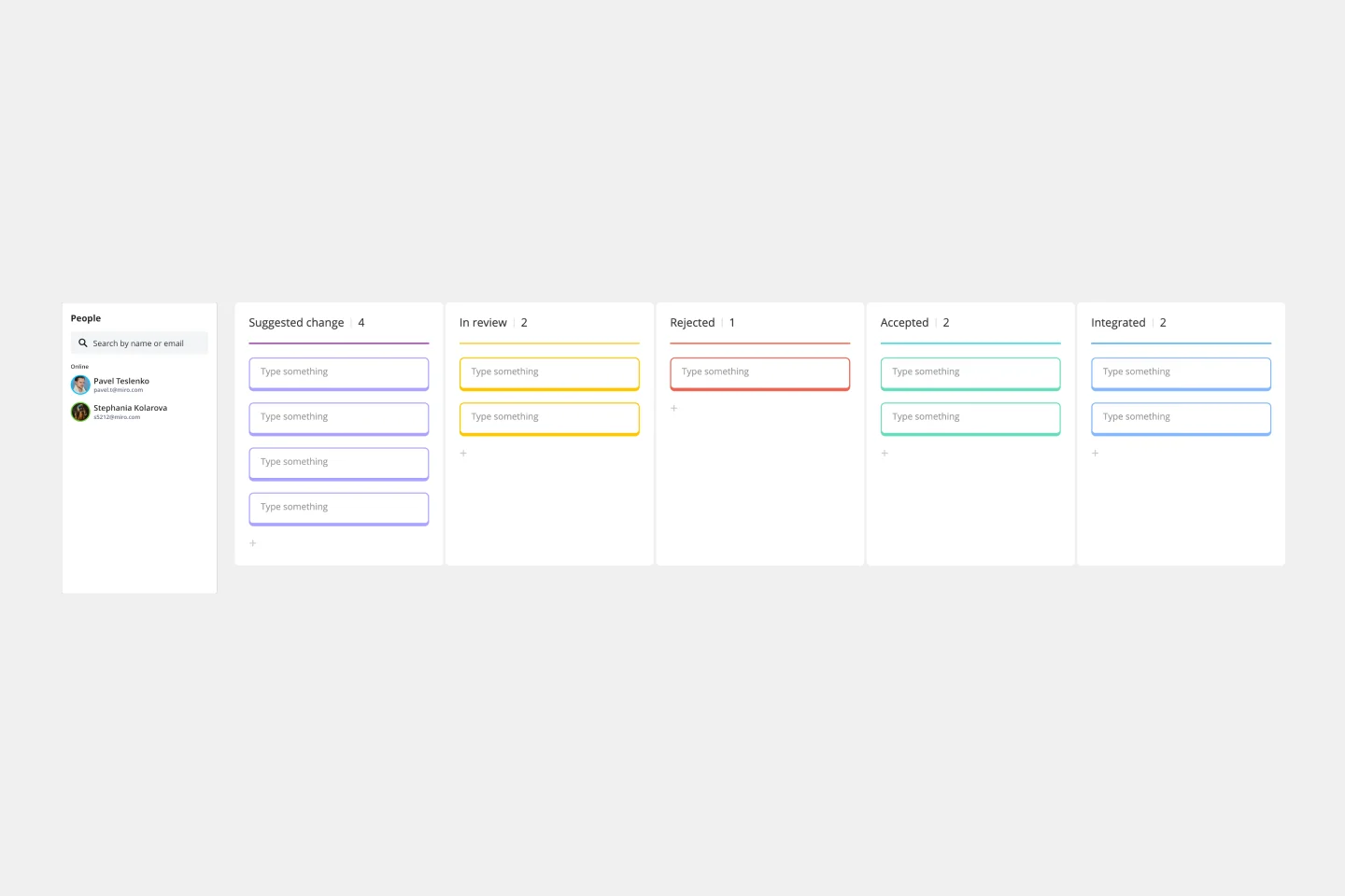
You can predict, research, and plan for every detail of a project to go a certain way—then along comes the unforeseen and modifications are needed. That’s when a change control process comes into play. It helps define the right steps to take, gives stakeholders full visibility, and reduces the chances of errors and disruption. And this template is easy to use and highly effective—for ensuring that proposed changes are reviewed before they’re implemented, and empowering teams to veto changes that might prove unnecessary or disruptive.
Block Diagram Template
Works best for:
Mapping, Software Development, Diagrams
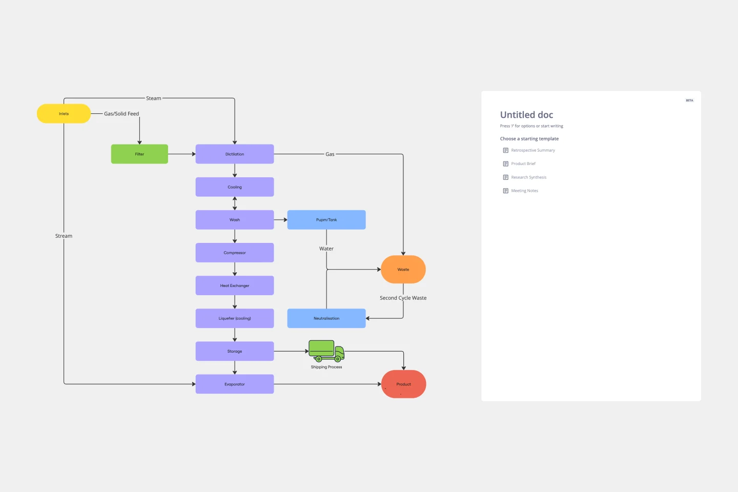
Use this template to illustrate technical systems. Blocks represent important objects in the system, and arrows demonstrate how the objects relate to each other. Perfect for engineers, workflow managers, or anyone trying to build a better process.
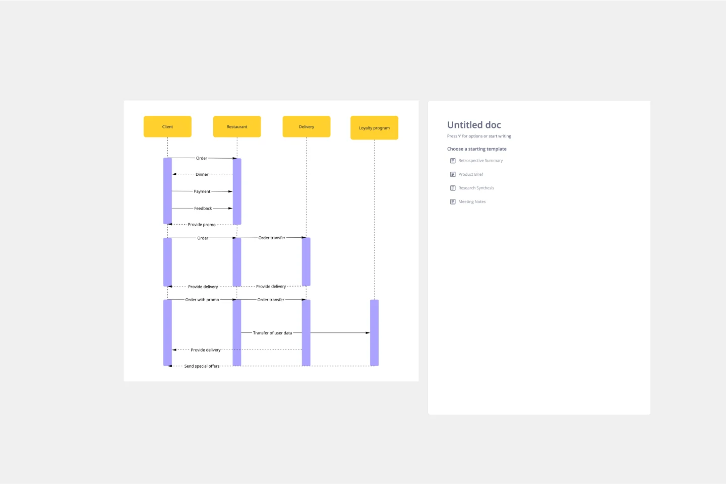
UML Sequence Diagram Template
Works best for:
Software Development, Mapping, Diagrams
Analyze and showcase how external entities interact with your system using a sequence diagram. Get a bird’s-eye view of your work processes, business functions, and customer interactions using this diagram. Also, identify any potential problems early and solve them before implementation.